Why the strongest brands say less, and why saying less is the hardest work in the room.
Why the strongest brands say less, and why saying less is the hardest work in the room.
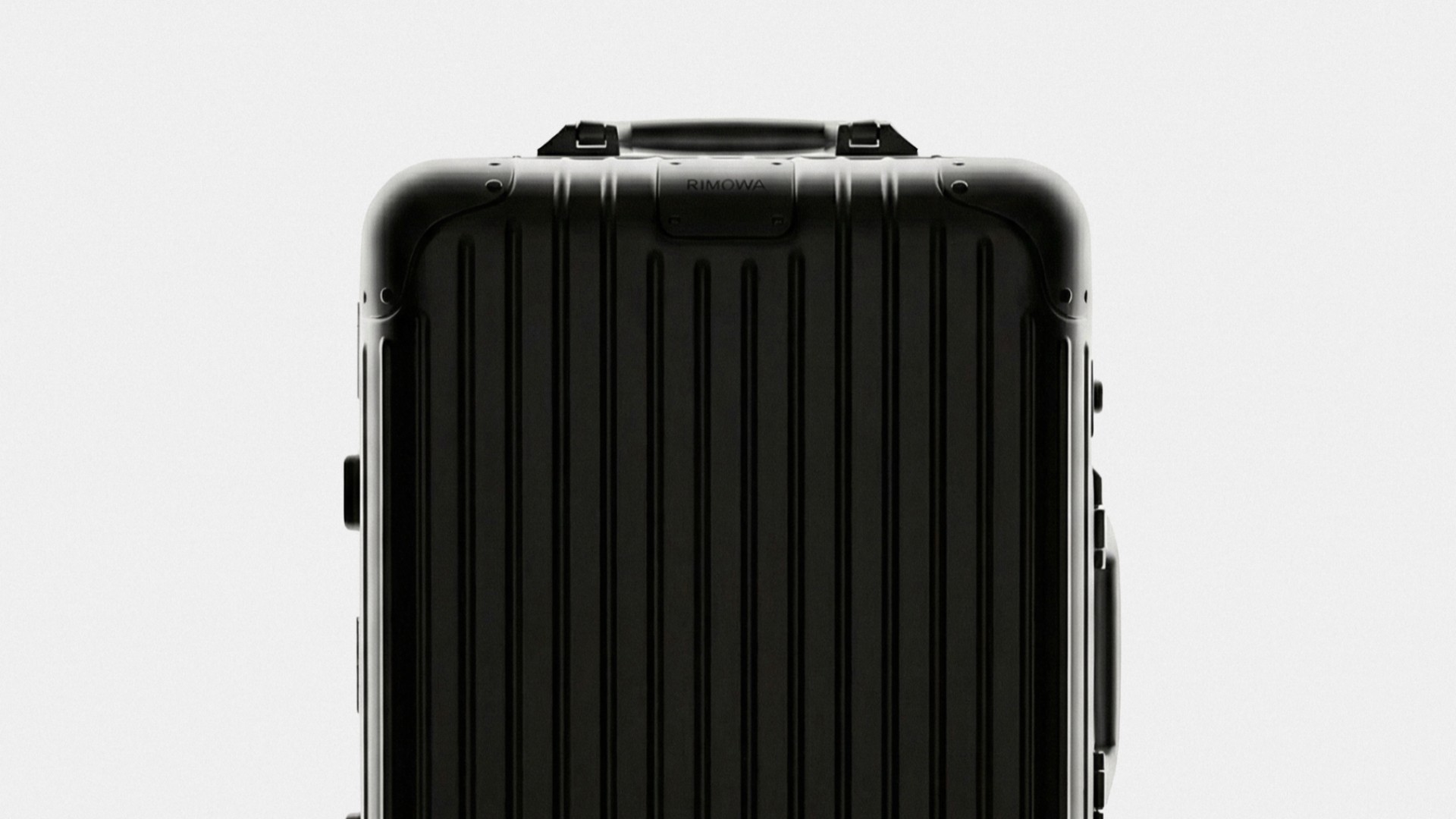
A brand is not what you add to it. It is what you had the nerve to leave out.
Most identities arrive overdressed. A second typeface for warmth. A gradient for energy. A secondary palette, an illustration style, a pattern drawn from the logo, a family of icons nobody asked for. Each addition can be defended on its own. Together they become a voice that talks over itself.
We work the other way. At Vytorget, every identity decision is a decision about removal. What does this brand not need? Which element is doing the work, and which is only keeping it company? The question is simple. Answering it honestly takes time.
Subtraction is a position
Restraint is often mistaken for an aesthetic: black and white, generous margins, a grotesk set small. It can look like that. But you can buy the look in an afternoon. Restraint is a stance on what matters, held for long enough that it becomes visible.
When a brand says less, everything it does say carries more weight. A single colour becomes recognisable because it is never diluted. A typeface becomes a voice because it is never interrupted. Empty space stops being empty. It becomes the place where attention gathers.
The brands we admire most can be identified from a fragment. The corner of a page, a few frames of film, a single line of type. They have reduced themselves to something so consistent that any part carries the whole.
One colour, held
Picture a single product photographed on a dark ground. No props, no second accent, no line of copy competing for the eye. Just the object and the space around it.
It feels like less. It works like more. Shadows gain depth, edges sharpen, and the whites inside the image begin to look deliberate. Nothing has been added. Something has been allowed to matter.
That is the whole argument in a single frame. Restraint does not reduce the work. It reveals it.
Confidence is quiet
There is a certain kind of Stockholm shopfront that explains this better than any brand guideline. A pale wall, one word in the window, a few objects placed with care. Nothing calls out to you, and still you notice it from across the street. The calm is ambition that no longer needs to announce itself.
Brands that over-explain are usually unsure of themselves. They add because adding feels like effort, and effort feels like value. More feels safer, too. It rarely is. Every extra element is a small hedge, and a brand built from hedges never quite commits to being anything.
Restraint asks for the opposite. It asks a founder to trust that the product can stand in a quiet room. It asks a designer to defend an empty space in a meeting where empty space looks unfinished. And it asks everyone to accept that recognition comes from repetition, which only works when there is very little to repeat.
What we leave out
So our process begins with an edit. We gather everything a brand believes it needs, then take things away until removing one more would leave something missing. That point, just before loss, is where an identity becomes itself.
What remains is rarely dramatic. A typeface. A colour. A rhythm of spacing. A tone of voice that knows when to stop. Minimalism is a style. This is precision, practised as a habit.
It is also what survives. Trends date the additions first. A brand reduced to its essentials ages the way good furniture does, slowly and well.
The brands that last never said the most. They said one thing clearly, then had the discipline to keep saying it.
Say less. Mean all of it.


